| Ted Yao |
Blog(posted on 12 Oct 2014)
Since 2008, I have made my own Christmas cards. They motivate me to create an image that I know will be seen by my closest friends and family (a sympathetic but sometimes very critical audience) and in a production run of about seventy or so, I can tweak the image and explore variations that deepen my journey into what I am trying to express. This year I am also sending them to those persons who have purchased my paintings as a marketing tool.
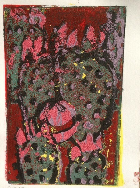
To those who want to try this interesting but highly time consuming self promotion, here are a number of pointers. Everything is backwards. The first step is the price, which is usually the last step in a painting. It's always free. Then, you have to get the envelopes, which will in turn determine the size of the image. (Thanks to Victoria Cowan for this teaching.) The first year, I did image first and then envelope, and had to make my own envelopes, a hideous task. Lately I have gone to Wal-Mart at their post Christmas sales and bought premade cards. I can probably get the card stock and envelope for under .25 per item. I then cut the card in half and glue one half to the front of a card, getting two cards for use as a base to affix the image. However, this is a high precision job and next year I think I will buy only store made blanks, marketed under the name of Creative Cards. This is close to $1.00 per card. The above is the image from 2012 of a prickly pear cactus with a Christmas ornament. This is a linocut, done by the reduction method, the sequence being yellow, dark red, purple, black and finally fuschia. Sadly no one ever saw this rich image. It was a trial run to test the colours. All the "production" items had a white background, a much less interesting image. Morale: before you begin to cut, think about the background! Since I owe so much to Victoria, I have developed also a tradition of sending her a card, which she kindly shows to her students as part of their education on what and what not to do. (posted on 7 Oct 2014)
Canadian printmakers face a double problem — the market is small so anything out of the ordinary has to be ordered from the States and because we printmakers are seeking to use products in a non-standard application, sales and support are also difficult. I had to do a lot of running around just to get my hands on the ink so I will save you some of the hassle by setting out the details. I am using acrylic Spinks Ink. This has a very long open time, very stiff ink and this is what I used in previous blogs. Professor Sippel says not use Akua ink, which cleans up with water, and it makes sense that it would be unsuitable. I have also tried Charbonnel, a lovely intaglio ink, but since it crusts over, I am sticking with Spinks. Remember you loosen this with linseed oil before applying with a sponge roller. Spinks does not sell to the public; I went through MarkAndy, which is a world wide distributor of litho presses. If you order on their website, shop.markandy.com, it will ask you where you reside and if you type in “Canada”, a new window pops up and you go from there. Roland Eble (reble@markandy.com) is the rep for Canadian sales. In my case, I paid with a credit card and the stuff arrived by UPS without having to pay duty. 1-800-387-3143. I bought the three primary colours, white and black as follows: pantone yellow 33, rubine red 18, process blue 58, black 700, opaque white 84. The Markandy site does NOT show the colours (just words) as its customers generally know what they want. PS treat Akua containers very carefully as they can crack in the base, if dropped, thereby creating a BIG MESS. (posted on 26 Sep 2014)
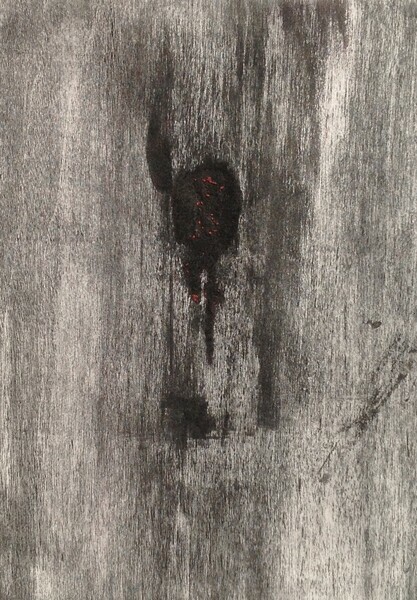
One of the most interesting discoveries that Professor Sippel revealed to us at was the use of the Sharpie pen as a marking device. Buffalo was an accidental example:
Be sure to use the water or oil-based poster paint with a ball that clicks to mix the paint, not the regular dye based Sharpie. The paint is applied thickly, in fact in Buffalo, the paint was recalcitrant and when I pumped the pen, a huge gob of ink appeared on the surface of the plate. I let it dry and thought that it was a failure not worth more preparation of the plate. When I printed this, I was astounded to find that the thick layer of dried Sharpie ink yielded a few dots of red underneath the black image. With a bit of experimentation and reading the Sharpie web site, I have discovered:
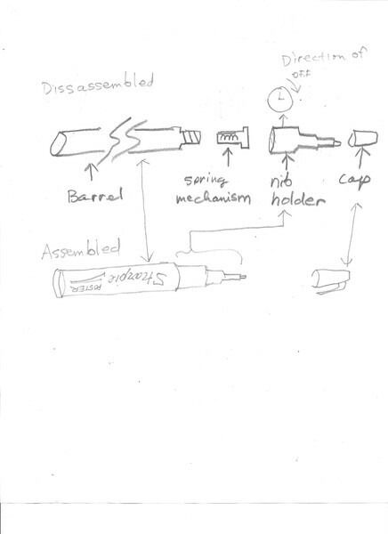
1. Marks on the plate are is not reliably printable, even by putting the Sharpie mark over gum Arabic. 2. A Sharpie dries instantly and is designed to be insoluble in water, or organic solvents such as mineral spirits, alcohol and Xylene. (Remember the primary purpose of Sharpies is to autograph sports memorabilia, so the company’s goal is make a non-smudgy mark with archival properties.) 3. However, something happens (I don’t know what) with repeated printing that makes a Sharpie mark reluctantly give up its ink and this slight shedding of colour can produce some subtle effects. You probably can’t see printed red although it is faintly visible in the original print. I added the two obvious red dots later. 4. I found that if you want a large amount of ink, a Sharpie can be disassembled by taking pliers to the nib holder and turning in a clockwise direction. This makes a big mess so use rubber gloves. The inner spring mechanism portion can be used as a pen to make bold gestural lines.
(posted on 30 Aug 2014)
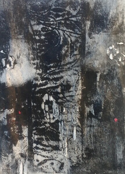
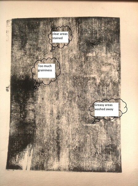
The point of printmaking is to reproduce the image reasonably reliably. Here is where mokulito fell down, at least for me. While the plate could be reused, each successive impression became "scummy", as soon as the second impression. Here is the second printing from the freshly made plate for After Crucifixion:
Pretty discouraging, huh? The ink is going where it shouldn’t and not going where it should. These are two different problems. The first is caused by a breakdown in the non-greasy ("white") areas, which don’t repel the ink the way they should. The second is a failure of the greasy area ("black") to accept the ink, and can be caused by poor technique right from the beginning. In After Crucifixion 1 I know it was caused by scrubbing too hard on the greasy areas and perhaps poor adhesion of the oil pastel crayon to the wood. (Remember I transferred this using a transfer technique of scumbling with crayon on fabric and then ironing the pattern on wood with a cool iron.) Therefore, here are Ted Yao’s two principles of non-scummy Mokulito:
As artists, we think of the image as optical, not chemical. Mokulito is a little like writing with invisible ink; what we want to do is produce a sustainable, greasy surface and equally, protect the non-greasy surface from being contaminated by ink. Thus, a litho crayon or oil pastel such as I used on the first go produces a lovely scribble line, but must be very gently washed, lest the pastel be washed away. I had better results when I washed with the tips of my fingers, under a stream of water and not scrubbing with the sponge. Incidentally I am using a terrific close pored sponge which is made right here in Glengarry County, Ontario and which I will describe in a future blog.
With respect to the damp surface principle, I found that each time you print an image, the dry paper wicks away the water, so the non-greasy surface is no longer damp. Thus, your first order of business after printing is to flood the surface of the plate with water, before inking again. Ink sparingly, I found two or three passes are best to avoid inking the clear areas. As you ink, inspect the surface carefully to make sure the ink is getting to all the greasy parts, just as you would do for an etching. Whether you have enought ink is hard to see when the surface is wet and shiny. When quitting for the day, apply gum Arabic immediately, before your cleanup. This helps prevent any application of gum Arabic to greasy areas, so that your plate will "remember" the image.
Finally a couple more tips: I used a hardware store paint roller not a brayer. Sponge not velour. The reason I think that this works better is that the roller being a sponge will automatically take away excess water thus allowing the inky parts of the same roller to release ink onto the greasy parts. I found that a sanded surface (as opposed to a scraped or planed surface) is rougher and helps your crayon (or other marker) adhere. A word to the frugal, ink tends to seep into the wood, making the whole surface greasy over time, so this is why plates can’t be cleaned and reused.
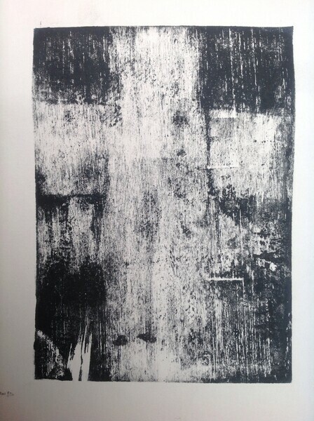
Using these principles, here is After Crucifixion 3:
(posted on 25 Aug 2014)
In July 2014, I took a course in printmaking from Jeff Sippel, Professor of Art at University of Missouri St Louis. Jeff travelled to Santa Fe to give the class at Don Messac's studio, "Making Art Safely". This is a worthwhile course and if you get the chance, it is a wonderful experience as New Mexico is a leading edge state for printmaking, just an hour away from the Tamarind Institute in Alburquerque. One of the innovative techniques I learned was how to do litho on plywood and I will be blogging about my attempt to do this at home. My first attempt was a copy of Antonio Saura's Crucifixion. I was going to entitle my blog "Failures" because I think you learn more from failures than successes but this seems too negative, even for me. One of the problems with the plywood technique ("Mokulito") is that over time, my images would acquire a uniform overall stain, resulting in a scummy mush. You can see my first print After Crucifixion, also in the Prints Gallery of this website. The steps I used followed Jeff's technique exactly. 1. Sand the block. 2. Make the image. 3. Talc the surface. (Careful to read the label - I used Baby Powder, which turned out to be cornstarch.) 4. Apply gum arabic. 5. Allow to dry overnight. 6. Wash off the gum arabic. 7. Apply ink with a sponge roller ( the hardware store kind, like you would use for latex paint). 8. Print normally as you would with a litho process. My second image was pure mush and I will dissect my failures in the next blog. (posted on 26 Sep 2013)
|

Copyright © 2025, Ted Yao. All rights reserved. | Administration
| Powered by ArtSites.ca.